세그먼티드* 컨트롤 segment 세그먼트 : (명) 부분, 조각 (동) 나누다, 분할하다 이와 대응하는 마땅한 단어를 찾지 못해 영어 표기 그대로 사용한다.
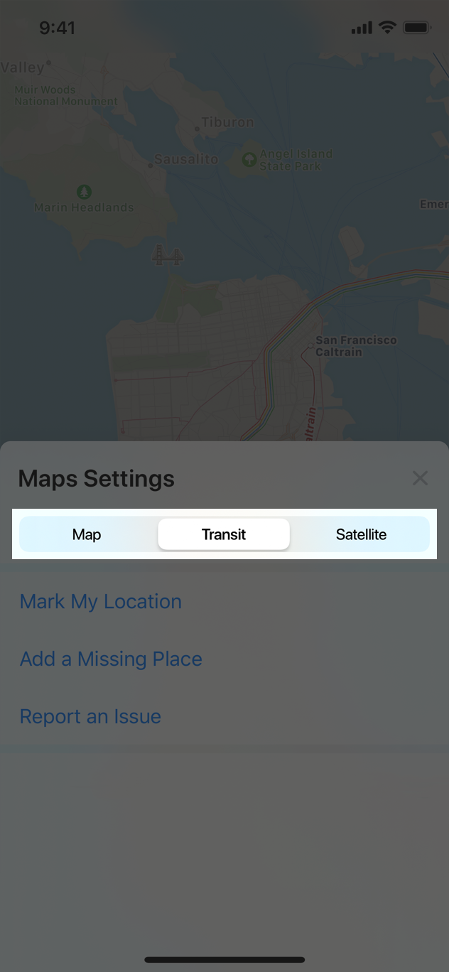
A segmented control is a linear set of two or more segments, each of which functions as a mutually exclusive button. Within the control, all segments are equal in width. Like buttons, segments can contain text or images. Segmented controls are often used to display different views. In Maps, for example, a segmented control lets you switch between Map, Transit, and Satellite views.
세그먼티드 컨트롤은 두개 이상의 세그먼트(조각) 세트로 이뤄진 선형의 컨트롤입니다. 각 세그먼트는 상호간 배타적인 버튼의 기능을 합니다. 이 컨트롤 안의 모든 세그먼트는 너비가 같습니다. 버튼처럼, 세그먼트는 텍스트나 이미지를 포함할 수 있습니다. 컨트롤은 주로 다른 뷰를 보여주기 위해 사용됩니다. 예를 들어 지도 앱에서는 컨트롤이 지도/ 교통/ 위성 뷰를 오갈 수 있도록 합니다.
Limit the number of segments to improve usability. Wider segments are easier to tap. On iPhone, a segmented control should have five or fewer segments.
사용성을 높이기 위해, 세그먼트의 수는 한정지으세요. 넓은 세그먼트일수록 탭하기 쉽습니다. iPhone의 경우, 세그먼트는 5개 이하여야 합니다.
Try to keep segment content size consistent. Because all segments have equal width, it doesn’t look great if content fills some segments but not others.
각 세그먼트 콘텐츠 사이즈는 일관되게 유지하세요. 모든 세그먼트는 동일한 너비를 갖고있기 때문에, 몇몇 세그먼트만 콘텐츠(텍스트, 이미지)로 꽉차있으면 좋아보이지 않기 때문입니다.
Avoid mixing text and images in a segmented control. Although individual segments can contain text or images, mixing the two in a single control can lead to a disconnected and confusing interface.
텍스트와 이미지를 컨트롤에 섞어 배치하지 마세요. 각각의 세그먼트는 텍스트나 이미지를 포함할 수는 있지만, 이 둘을 하나의 컨트롤에 섞는다면 동떨어지고 혼란스러운 인터페이스를 만들 것입니다.
Position content appropriately in a custom segmented control. If you change the background appearance of a segmented control, make sure content still looks good and doesn’t appear misaligned. For developer guidance, see UISegmentedControl.
커스텀 세그먼티드 컨트롤엔 콘텐츠를 적절히 배치하세요. 만약 배경 외형을 바꾼다면, 그 안의 콘텐츠가 여전히 좋아보이고 정렬되보이도록 하세요.