머티리얼은 이렇게 뒤를 뿌옇게 만드는 효과
iOS provides materials (or blur effects) that create a translucent effect you can use to evoke a sense of depth. The effect of a material lets views and controls hint at background content without distracting from foreground content. To produce this effect, materials allow background color information to pass through foreground views, while also blurring the background context to maintain legibility.
When you use the system-defined materials, your elements look great in every context, because these effects automatically adapt to the system’s light and dark modes.
iOS에서 제공하는 materials(혹은 블러 효과)를 사용하면 투명 효과로 깊이감을 만들어낼 수 있습니다. 머티리얼을 사용하면 전면 콘텐츠를 방해하지 않으면서도 배경 콘텐츠가 슬쩍 보이게 해주죠. 즉, 배경 콘텐츠의 색이 전면 콘텐츠를 뚫고 보여지지만, 동시에 배경 콘텐츠는 블러 처리되어 전면 콘텐츠를 읽는데는 문제가 없습니다.
시스템에서 정의한 머티리얼을 사용할 땐, 앱의 요소가 어떤 맥락에서도 좋아보이도록 하세요. 왜냐면 이 효과는 시스템의 라이트/ 다크모드에서 자동으로 적용되기 때문입니다.
<aside> 💡
TIP Materials require the presence of a visual effect view in your view hierarchy. For developer guidance, see UIVisualEffectView. 머티리얼을 사용하기 위해선, 뷰 계층 구조 안에 시각 효과 뷰가 있어야 합니다.
</aside>
Be guided by the materials the system uses. Whenever possible, compare your custom views to system-provided views that enable similar functionality and use the same materials.
시스템이 사용하는 머티리얼에서 가이드를 얻으세요. 가능하다면 당신이 커스텀한 뷰와 시스템에서 제공되는 뷰를 비교해 비슷한 기능성을 갖고있는지, 같은 머티리얼을 사용하는지 확인하세요.
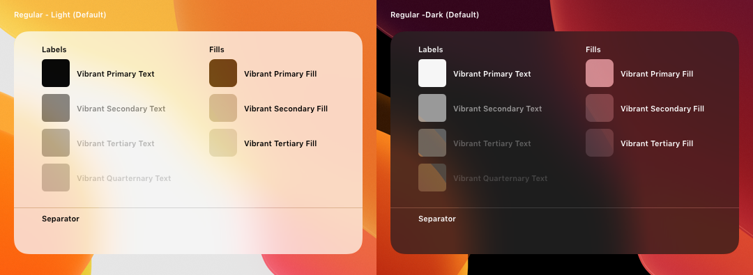
Take advantage of the system-provided colors for text, fills, glyphs, and separators. The system-provided colors automatically make these items look great on translucent backgrounds. For guidance, see Dynamic System Colors.
시스템이 제공해주는 텍스트, 채우기(필), 글리프, 구분선 등을 사용하세요. 시스템이 제공하는 색상은 이 아이템들이 투명한 배경에 있을 때도 멋지게 보이게 해줍니다. 가이드는 Dynamic System Colors 에서 확인하세요.
When possible, use SF Symbols. When you use dynamic system colors to color a symbol, or apply a vibrancy effect to it, the symbol looks great in any context. In contrast, full-color images may not have sufficient contrast with the background and may seem out of place when used in a view with a translucent background. For related guidance, see SF Symbols.
가능하다면, SF Symbols를 사용하세요. 다이나믹 시스템 컬러를 심볼에 사용하거나 vibrancy(뒤가 비치는 투명한 효과) 효과를 적용하면, 심볼은 어떤 맥락에서도 멋져보일 것입니다. 반면, 풀컬러 이미지는 배경과 충분한 대비가 이뤄지지 않을 수 있고, 투명한 배경과 사용했을 땐 제 위치에 있지 않는 것처럼 보일 수도 있습니다. 관련 가이드는 SF Symbols 에서 확인하세요.
iOS defines materials you can use in specific areas to control the visual separation between the foreground content and the background appearance. The system-provided materials include both light and dark variants that work well against most backgrounds.
For use in content containers, iOS 13 defines four materials that have different levels of translucency (each material also includes a dark variant):
iOS에선 머티리얼을 전면 콘텐츠와 배경 화면을 시각적으로 분리하기 위한 특정 부분에만 사용해야 한다고 규정합니다. 시스템의 머티리얼은 라이트/다크모드 두가지 경우를 모두 포함하며 이는 대부분의 배경과 잘 어우러집니다.
콘텐츠 컨테이너에 사용하려면, iOS 13에선 네가지 머티리얼을 규정해 서로다른 단계의 투명도를 보여줍니다 (또 각 머티리얼은 다크모드 버전도 있습니다.) :