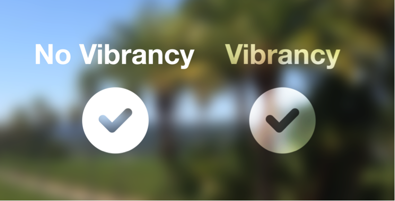
In iOS 13.0 and later, people can choose to adopt a dark system-wide appearance called Dark Mode. In Dark Mode, the system uses a darker color palette for all screens, views, menus, and controls, and it uses more vibrancy to make foreground content stand out against the darker backgrounds. Dark Mode supports all accessibility features.
iOS 13 이후부터 사용자들은 '다크 모드'라 불리는 다크 시스템 형태를 선택하고 적용할 수 있습니다. 다크모드에선 시스템이 모든 화면, 뷰, 메뉴, 컨트롤에 어두운 색상 팔레트를 사용하며, 전면부의 콘텐츠가 어두운 배경으로부터 더 도드라져보이도록 vibrancy*를 부여합니다. 다크모드는 모든 손쉬운 사용 기능을 지원합니다.
*Vibrancy. 사전에 위와 준하는 단어를 못찾겠어서 계속 vibrancy를 사용할 예정.


Dark Mode (좌) Light mode (우)
In Settings, people can choose Dark Mode as their default interface style and schedule automatic changes between the appearance modes. Because people make these choices at a systemwide level, they generally expect all apps to respect their preferences.
사용자들은 설정에서 다크모드를 화면의 기본 스타일로 정할 수 있고, 자동으로 변하게 시간을 맞춰둘 수도 있습니다. 사용자들이 시스템 단계에서 결정을 내리기 때문에, 자연스레 모든 앱들이 사용자의 선호를 따르길 기대할 것입니다.
Comply with the appearance mode people choose in Settings. If you offer an app-specific appearance mode option, you create more work for people because they have to adjust more than one setting. Worse, they may think your app is broken because it doesn't respond to their systemwide appearance choice.
사용자들이 설정에서 고른 모드를 준수하세요. 만약 앱에 특화된 특정 모드 옵션을 제공한다면, 사용자들에게 설정에서 따로 또 조절하라고 일을 하나 더 만들어주는 셈입니다. 더 나쁜 것은, 사용자들이 당신의 앱은 시스템 단계에서 설정한 모드를 따르지 않으니 고장났다고 생각할 수도 있다는 것입니다.
Test your designs in both light and dark appearances. See how your interface looks in both appearances, and adjust your designs as needed to accommodate each one. Designs that work well in one appearance might not work in the other.
라이트, 다크 모드 두가지 경우 모두 디자인을 테스트하세요. 당신의 화면이 두 모드에서 다 좋아보이는지 보고, 필요한 경우 각각의 모드를 위해 디자인을 수정하세요. 한쪽 모드에서만 잘 작동하는 디자인은 다른 모드에서 그렇지 못할 수도 있습니다.
Ensure that your content remains comfortably legible in Dark Mode when you adjust the contrast and transparency accessibility settings. In Dark Mode, you should test your content with Increase Contrast and Reduce Transparency turned on, both separately and together. You may find places where dark text is less legible when it’s on a dark background. You might also find that turning on Increase Contrast in Dark Mode can result in reduced visual contrast between dark text and a dark background. Although people with strong vision might still be able to read lower contrast text, such text could be illegible for people with visual impairments. For guidance, see Color and Contrast.
손쉬운 사용 설정에서 대비와 투명도를 조절해도, 콘텐츠가 다크모드에서 여전히 잘 보이는지 확인하세요. 다크모드에서 대비 증가와 투명도 줄이기 옵션을 모두 또는 각각 켰을 때 콘텐츠가 잘 보이는지 꼭 테스트해야합니다. 어두운 배경에서 어두운 색의 텍스트가 잘 안보이는 지점을 찾을 수 있을 것입니다. 또 다크모드에서 대비 증가 옵션을 켰을 때 어두운 색의 텍스트와 어두운 배경 간 시각적 대비가 줄어드는 것도 발견할 수 있을 것입니다. 시력이 좋은 사용자들은 저대비 테스트를 읽을 수 있을지 몰라도, 시각 장애가 있는 사용자들에겐 불가능할 수 있습니다. 가이드는 Color and Contrast 에서 확인하세요.
The color palette in Dark Mode includes darker background colors and lighter foreground colors that are carefully selected to ensure contrast while maintaining a consistent feel between modes and across apps.